
Level Design
Overview
As the Level Design Lead for Guncaster, I established clear standards and workflows for building performant, readable, and mechanically engaging environments. My approach emphasized player movement, visual clarity, and efficient level construction. I pushed for full use of ProBuilder not just as a rapid prototyping tool, but as the final solution for collision and mesh creation. This kept fast-paced gameplay feeling responsive and clean. The result was an optimized design pipeline that prioritized both performance and playability across every scene.
As the Level Design Lead for Guncaster, I established clear standards and workflows for building performant, readable, and mechanically engaging environments. My approach emphasized player movement, visual clarity, and efficient level construction. I pushed for full use of ProBuilder not just as a rapid prototyping tool, but as the final solution for collision and mesh creation. This kept fast-paced gameplay feeling responsive and clean. The result was an optimized design pipeline that prioritized both performance and playability across every scene.
Contributed Breakdowns
LEVEL DESIGN
Leadership
To ensure every level supported our game’s fast and expressive movement, I implemented a set of design guidelines across the team:
Reducing Imported Assets: The original Guncaster relied heavily on third-party assets, which caused slow iteration times, bloated builds, and a cluttered project structure. I pushed to transition toward handmade assets throughout development to address this at the source.
Mesh Efficiency & Collision: All scenes used ProBuilder exclusively for environment geometry and collision. This allowed designers to iterate and hand-tune layouts quickly while dramatically lowering mesh complexity. It also helped at reducing asset bloat and ensuring custom-built geometry never interfered with player motion.
Performance Constraints: I set caps on particle counts and limited material complexity where possible to keep performance consistent across scenes. Levels were deliberately uncluttered so player focus stayed on movement and threats rather than background noise.
Combat Scenario Variety: Each encounter space was designed to apply a different type of pressure. Some rooms offered vertical freedom for wall-kicks and mid-air combat; others were narrow or maze-like to force reactive decision-making. Even open spaces were built with parkour flow in mind, where players were rewarded by movement mastery.
Functional Flow: Between key fights, I spaced out encounters with short traversal corridors or moments of calm to keep pacing engaging. These transitions weren’t just filler, they gave players breathing room while reinforcing the game's rhythm and respecting performance budgets.
A brief history
Screenshots

THE DUNGEON

THE SEWERS

SCHOLARS TOWER

MOONLIT SUMMIT
SKYISLANDS
Levels
The Dungeon


Designed to be tight, oppressive, and relentless, the Dungeon pushed players into close-quarters combat where escape was rarely an option. Rooms were intentionally narrow with limited verticality to amplify tension, building a heavy reliance on fast reflexes and getting used to simple movement like jumping and dashing. Every encounter demanded constant motion as enemies closed in quickly and punished players who tried to hold still.


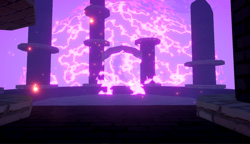

While still compartmentalized like the Dungeon, Scholar's Tower introduced a clearer rhythm between combat and traversal. Arena-style rooms offered more breathing space and vertical freedom, giving players room to experiment with dashing, wall kicks, and other movement abilities. Parkour segments were deliberately embedded between combat zones and served as both a cooldown and a skill check that reinforced the game's mobility systems.
The Scholars Tower


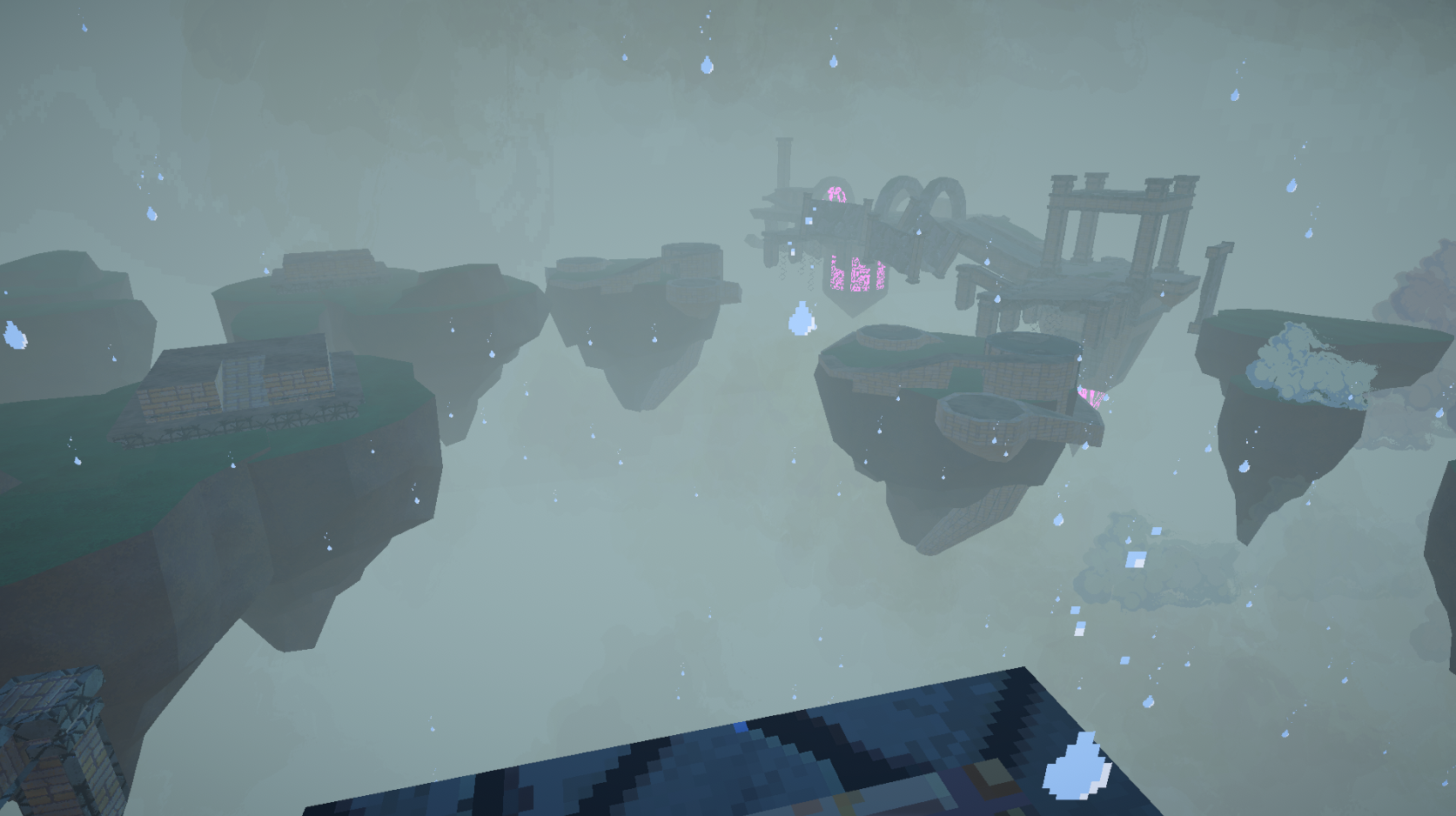
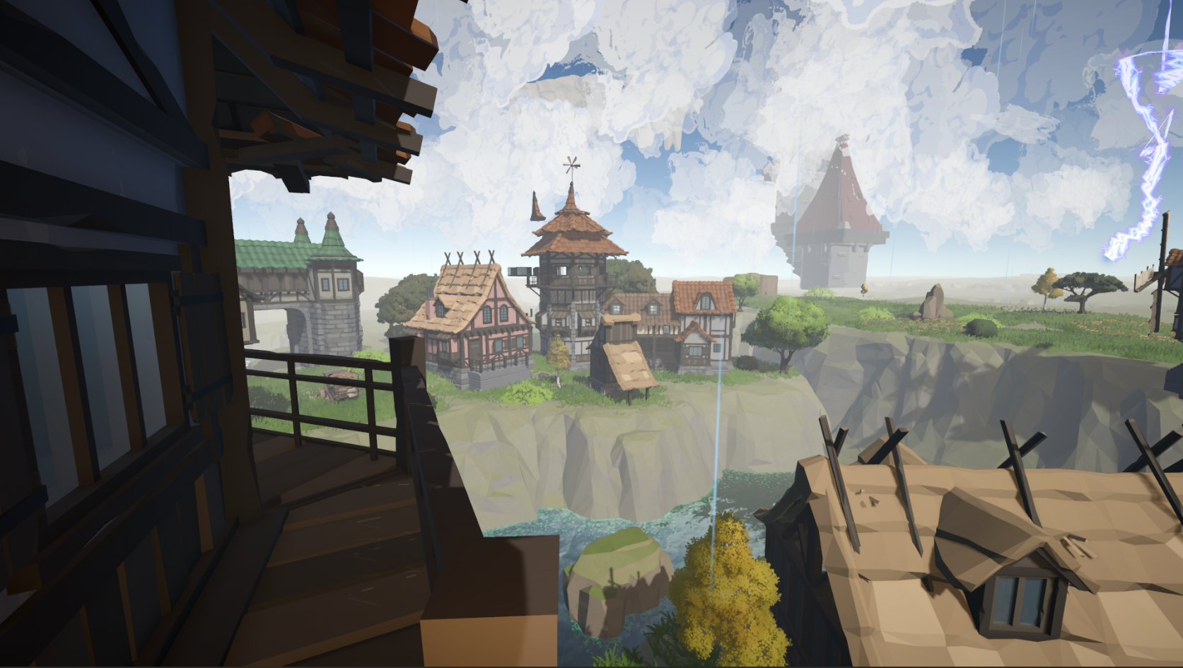
A stark contrast to everything before it, Sky Islands offered a liberated traversal experience with no overhead constraints, no forced corridors, just momentum and space. Players could approach encounters from any direction, and the open layout demanded genuine spatial awareness through floating platforms and minimal grounding. Confidence in both movement and combat was rewarded here more than anywhere else in the game.
The Sky Islands
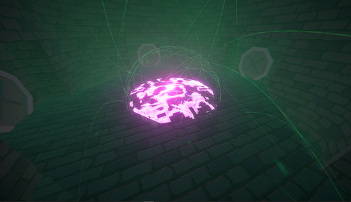


The Sewers began as another designer's concept, but I took ownership of the layout, rebuilt the collision for smoother navigation, and optimized the geometry for performance. The structural groundwork was solid and the level added variety to the game's biome rotation. Time constraints prevented a full visual polish pass, and it remains the least refined of the shipped zones.
The Sewers


The Mountains was a collaborative effort. I oversaw the design process, offering guidance on module structure, encounter flow, and spatial decisions while Kay Blake, our Lead Artist, handled the hands-on construction. My role here was directorial rather than technical, ensuring the zone fit within the broader level design standards and pacing of the game.
The Mountains
Didn’t Ship
Enchanted Forest
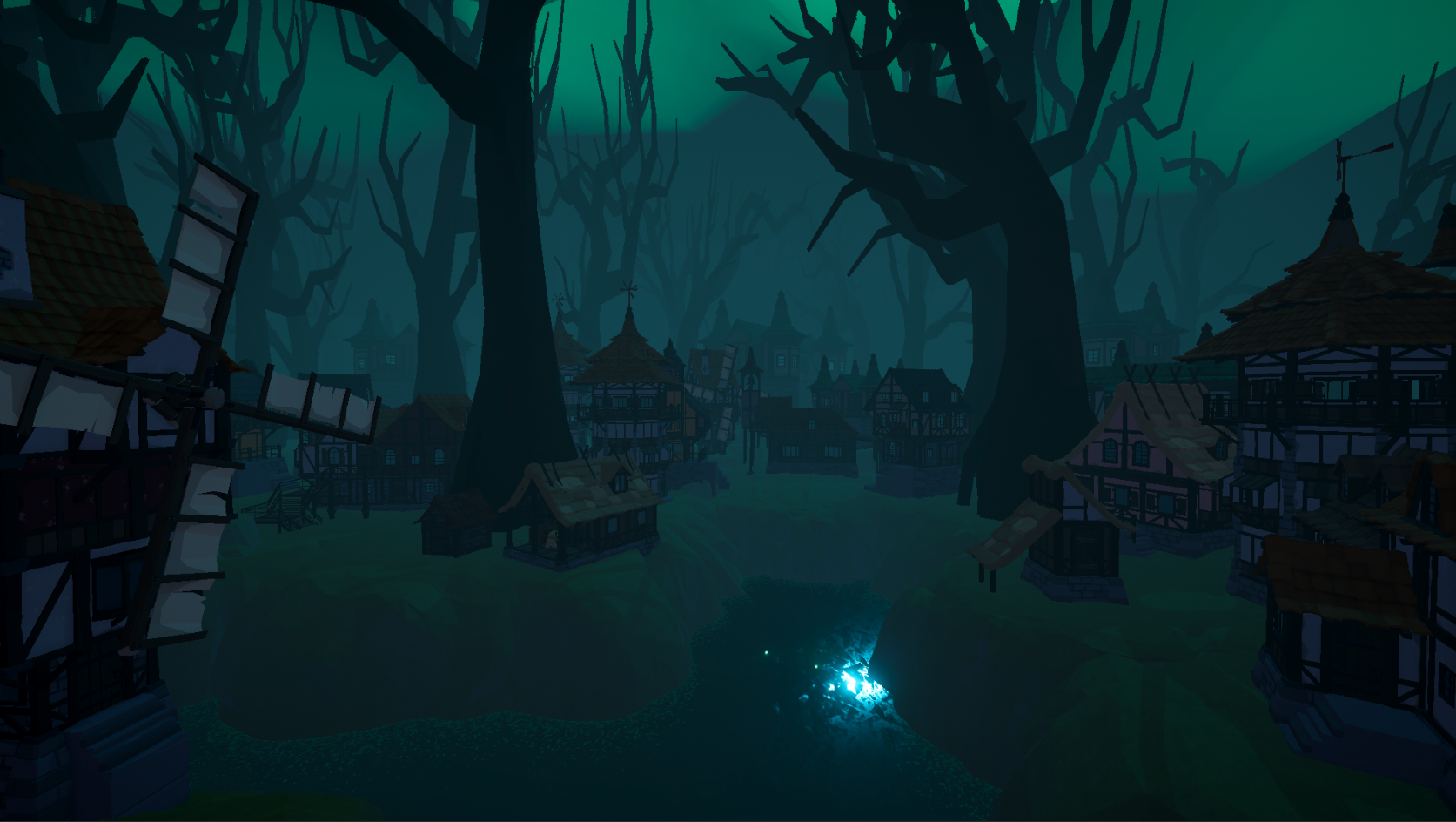
My first exploration of open-world modular design, the Enchanted Forest aimed to feel expansive yet navigable. It would house natural elements like tree walls and organic blockades that would guide players without being visible like walls. Despite early technical hurdles with the module snapping system, I got procedural generation working within the tileset. The zone was designed around fast horizontal movement and hectic encounters within a maze-like structure, offering a wilder, less controlled experience than the game's indoor levels.
Somber Planes
Crystal Caverns
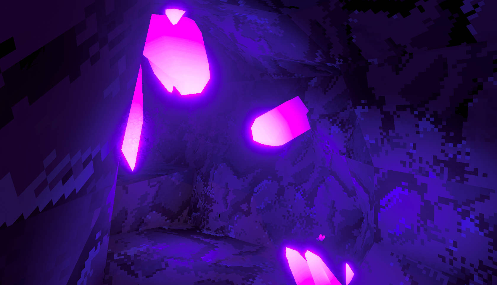
A transitional zone designed to ease players into broader movement mechanics before throwing them into more demanding environments. The Somber Planes prioritized player agency. Encounters could be approached head-on, flanked, or bypassed entirely through exploration. It was intended as a strategic buffer between tighter interior levels and the open chaos of Sky Islands, giving players space to find their footing before the game's difficulty escalated.
A hybrid zone blending the claustrophobia of the Dungeon with the natural complexity of an outdoor environment. Larger rooms and environmental hazards were designed to create more reactive, dynamic encounters than the game's earlier levels. Development was halted due to time constraints and the difficulty of producing quality organic assets within scope, but the concept informed later thinking about biome variety and environmental storytelling.
Additional Features
Beyond the core level layouts, I introduced several environmental details to reinforce immersion and gameplay clarity:
Hand-placed set pieces with sound effects and particles increase immersion
Reverb zones tuned per area to make spaces feel acoustically distinct and reinforce the audio system
Area-specific particle effects that interact with environment and add atmosphere to each zone
Particle force fields that continuously draw effects toward the level exit so players can navigate themselves
Added reactive level modules that change in some way to signal completed battles for players trying to clear levels
Hand-placed off-mesh links to extend AI pathfinding into vertical space, allowing enemies to navigate platforms and elevated terrain
What Went Right
The final stretch of development was when level design truly came into its own. Once I had the time to focus on environments properly, the team iterated quickly and the results were better than I expected. The Dungeon held up well as a foundation, the Scholar's Tower rework exceeded my original vision, the Sewers added variety to the level pool, the Mountains were simple and refreshing, and Sky Islands became the most enjoyable zone to both build and play. The module snapping system made iteration genuinely fast once established; tuning prefabs and adjusting encounters was straightforward and rarely broke anything downstream.
Some of the best design decisions came out of constraint. When playtesting revealed levels felt too maze-like, I opened up sightlines and added spatial breathing room. These changes players noticed and responded to positively. When players mentioned they couldn’t navigate the open spaces either I made the exits visually loud and big and added a directional particle system that quietly did real navigational work, drawing players toward exits without a single UI element. Leading the team through this process was rewarding too. Disagreements came up, but open conversations resolved them quickly, and community feedback between iterations helped us prioritize changes that genuinely improved the experience. By the end, the level design team operated smoothly and shipped something we were all proud of.
What Went Wrong
Level design went through more iterations than it should have, largely because early placeholder modules built for testing had to be rebuilt from scratch once standards were established. The old level work quickly compounded over time in part because a different issue. The bigger underlying issue was asset bloat. Early in development we leaned heavily on third-party imported assets to compensate for our timeline and the absence of a dedicated 3D artist. At its worst the project ballooned to nearly 5GB with less content than the shipped build, which landed at 1.31GB. A significant portion of the remaining bloat lives in the tutorial level, built almost entirely from imported assets by a team member who left before it could be addressed.
Enemy balancing also became entangled with level design in a way I didn't anticipate. The original system scaled enemy health and abilities dynamically based on player progression, but we ran out of time to tune it properly and fell back on per-level enemy presets set at the module level. That meant any balance adjustment, buffing Sky Islands enemies, for example, had to be applied manually across every individual module rather than centrally. It was tedious and error-prone.
I also want to be transparent that my active involvement in level design only opened up in the final four months, and within that window I spent roughly two to three weeks on it directly before shifting to other systems. The Sewers in particular reflects that constraint, after my initial layout pass the original designer didn't follow through on texturing or polish. While I got it to a shippable state, it remains the zone I'm least satisfied with.